
I'll admit it, I like collage's. I sometimes use that technique when I am creating marketing materials for work. So, I was looking forward to this assignment. Initially I was thinking about trying to create a politically based collage of some sorts- try to make a statement. In the end, I decided to create a collage about travel. In this assignment, we had the chance to layer several pictures together and individually manipulate the layers. Also, we should add text and manipulate that a bit as well.
Usually when we think of travel, we might picture a jet or car - some type of fast travel. I wanted to incorporate images invoking a different, slower sort of travel - maybe travel where the destination was not quite as defined as travel usually is - hence "all other destinations".
My first layer was a map of Paris which I initially brightened in Photoshop and then distorted a little in Fireworks. I wanted the map to be apparent, but not overbearing. With each new layer/photo addition, I did something a little different to it. The Amish buggy and the camel shadow were cut using the lasso tool, the compass with the elipse marquee and the other images with the rectangular marquee. The old Lufthansa plane was slightly distorted, "All Other Destinations" is somewhat transparent and the Difference blend mode was used on it, the sailboat image was transformed using soft dodge, the hot air balloon with exclusion blend mode, the word "Travel" was moved with free transform and has a drop shadow.

All photos were downloaded from the Stock Xchng website -www.sxc.hu. (There are many photos available for free on this site).
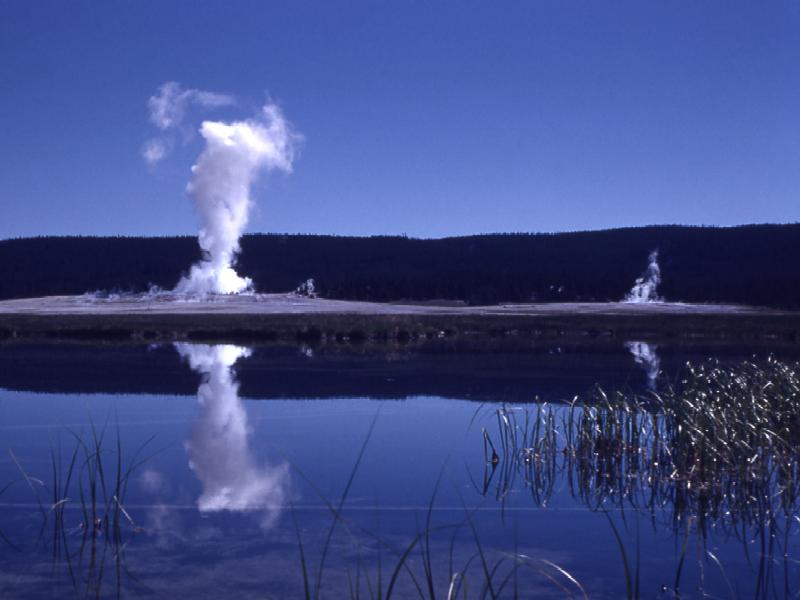
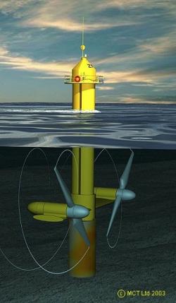
 o photo to add some continuity to the photo. The color was slightly off and there was a noticeable line, so I smudged the line and then placed a windmill copy on the line to try to hide it a little. The windmill photo is one I took a couple years ago when we were driving by Madison, NY. I also tried to incorporate the geyser photo into the strip-mine photo by erasing with varying degrees of opacity. I did the same with the tidal turbine photo which is below the solar panel. I tried to think of different ways to incorporate the solar panels into the montage, ranging from the equipment carrying them to making them part of the landscape. In the end, I just left them as sort of free flowing. The grenade looking thing is actually a methane digester with a couple of compact fluorescent bulbs sticking out of them. The tops of the digesters suggested themselves as receptacles of the lightbulbs. One could probably come up with a couple of analogies for the methane digesters as grenades.
 (The original photos can be found at the links). I had a couple other photos I was intending to incorporate into the montage - sunflowers with an old gas tank for bio-diesel and a solar hotpot, but in the end did not use them.


